
Owning AMCL’s Planning for Assets Tool
Solo design lead on PWay Calc, taking a first-time founder's idea from spreadsheet to shipped iOS app, through branding, UX/UI, and marketing design.
Overview
Planning for Assets tool is an asset lifecycle modelling tool which manages asset whole life cost modelling at portfolio scale, helping to test asset investment options and optimize spend.
The product was created by AMCL, originally in a spreadsheet. The company wanted to launch P4A as a web-based tool and this was their first time creating a product (don’t know how to say this - they traditionally sell personal services but this was their first packaged tool which they could sell. Branching into a new market). I was brought on as the lead designer, working from the ground up.
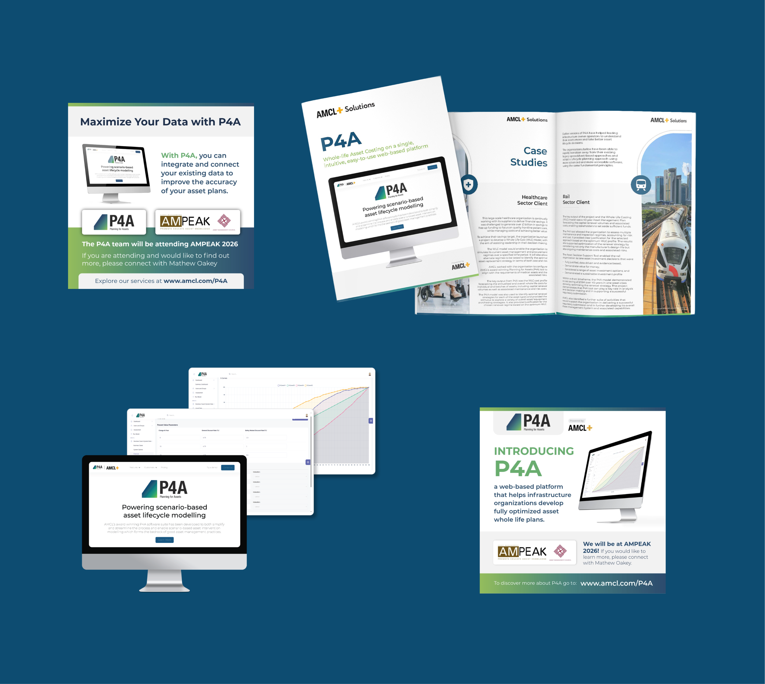
I designed the brand identity, was in charge of leading responsive web design, and created the products marketing and sales materials, to be used at conferences and online.
Brand Identity
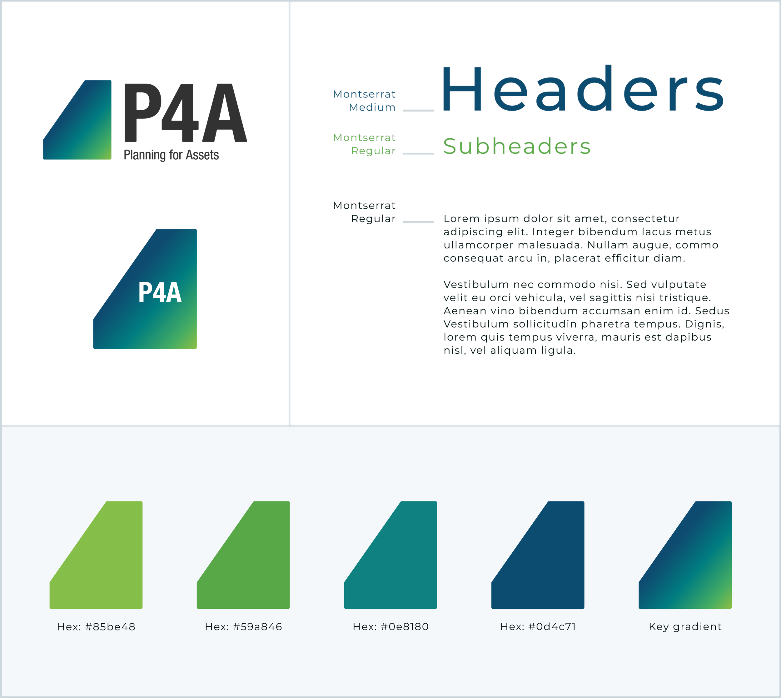
What do I want to say about the branding? Why did we make these choices? What are we going for here? Making it cohesive with the AMCL brand colors but still distinct? Used an AMCL core color blue and then added the P4A neon green highlight
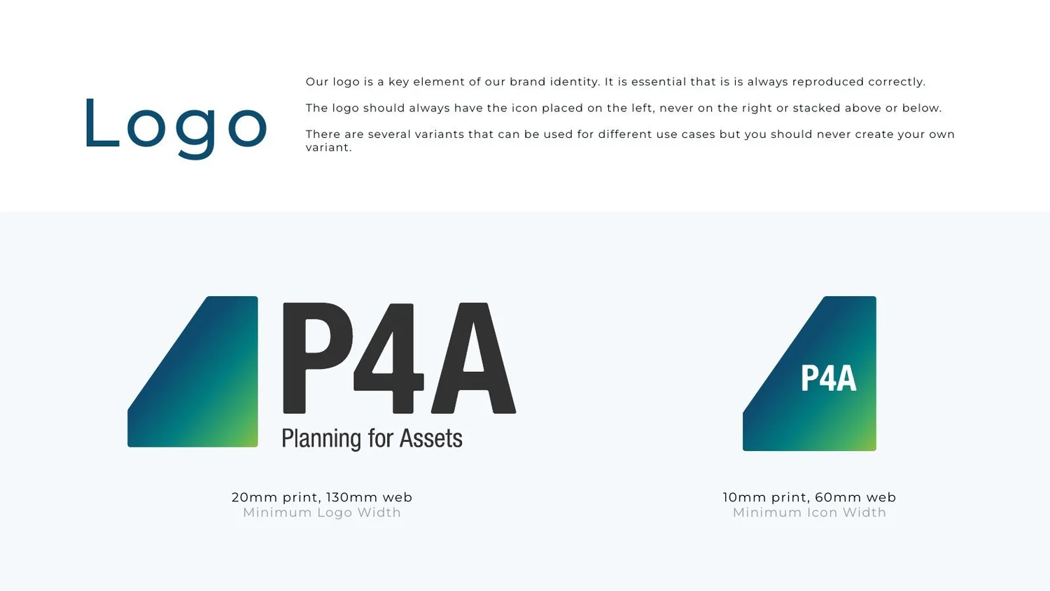
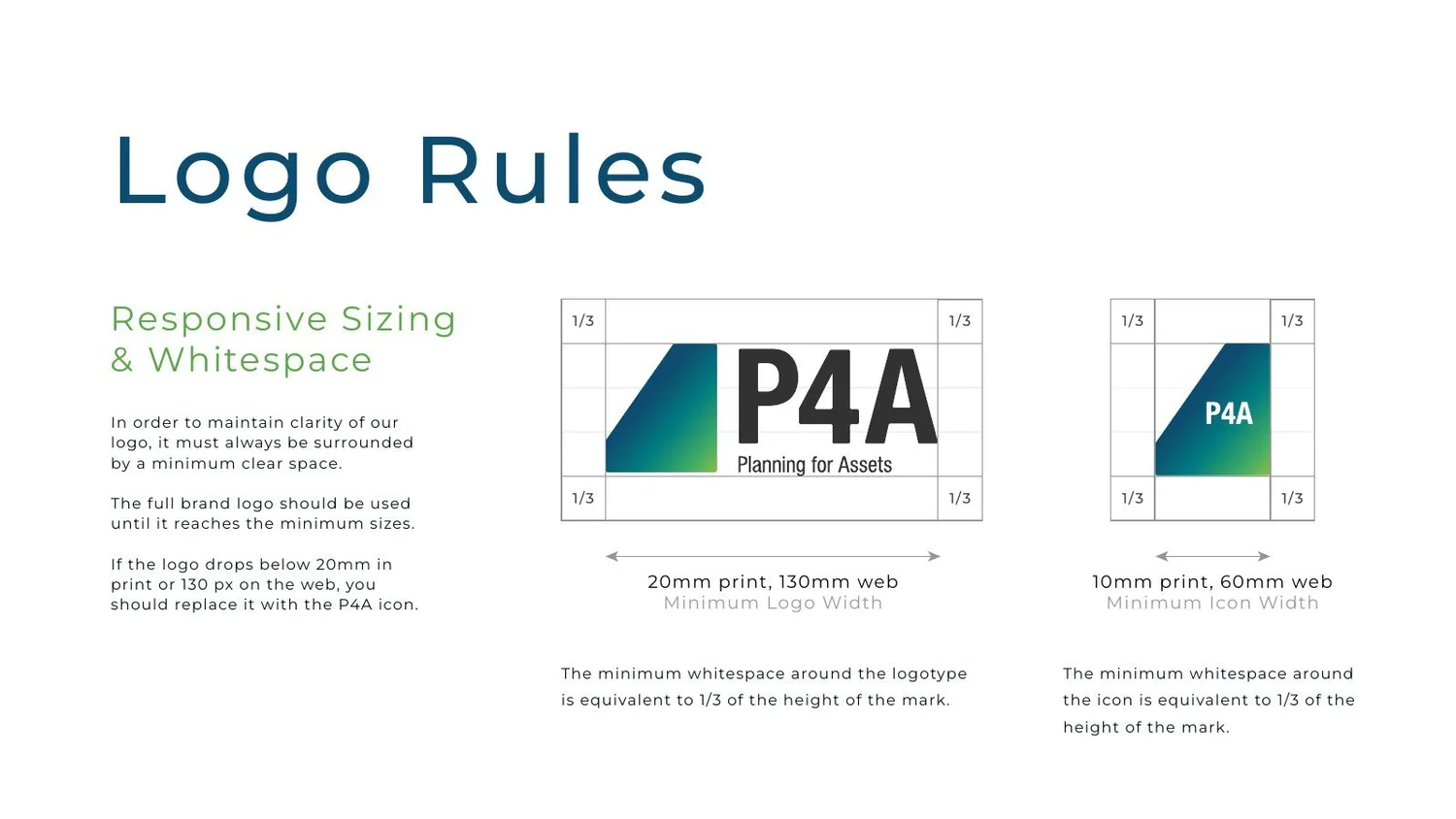
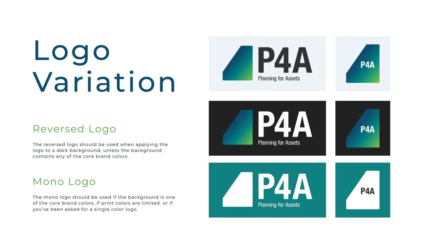
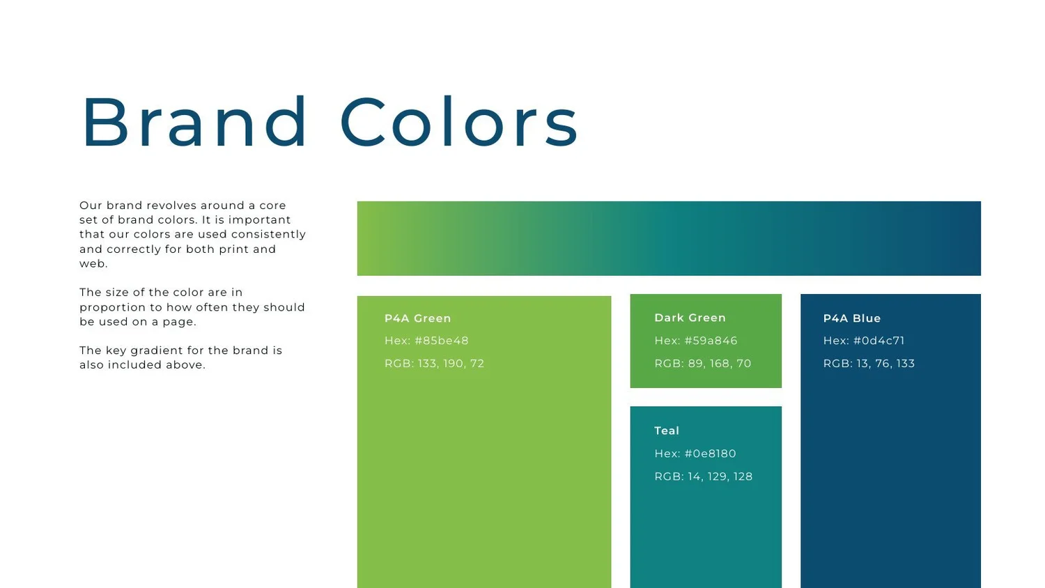
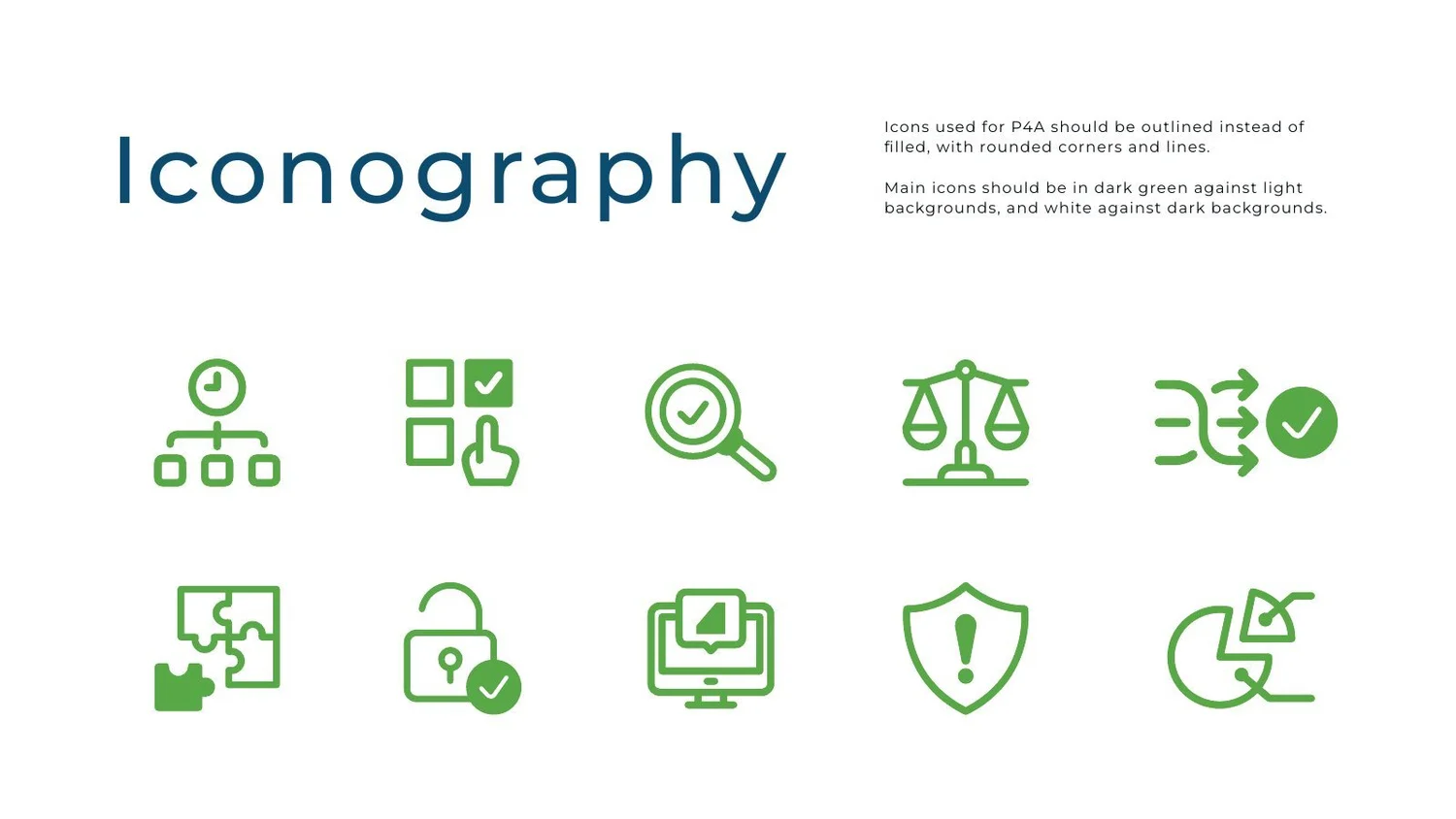
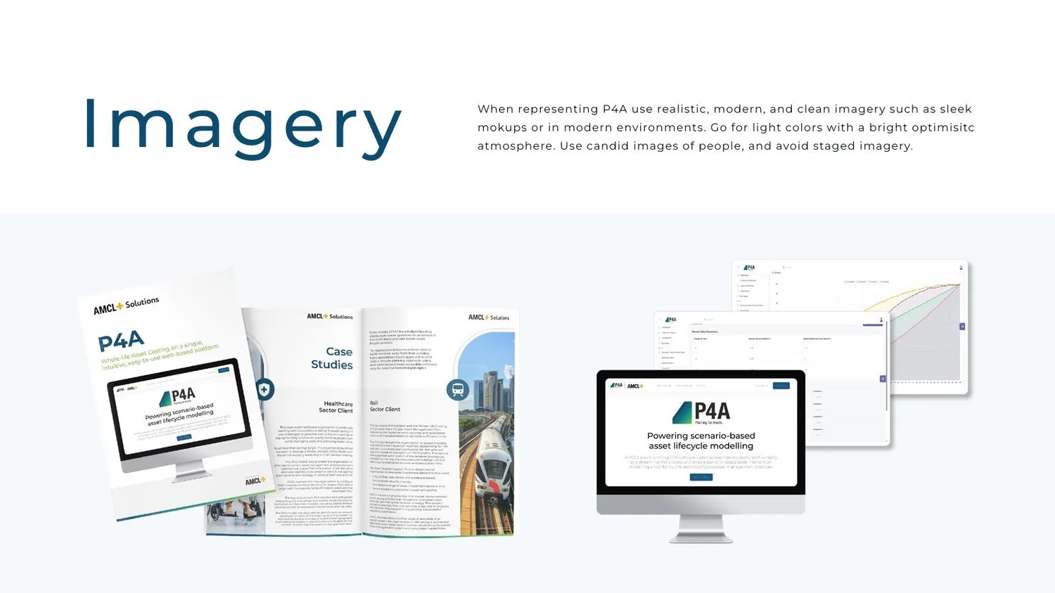
Color Palette: I chose a steel blue and orange palette to reflect the railway engineering context — steel blue nods to rail and industrial materials, while the orange (echoing high-visibility safety gear) adds contrast and energy.
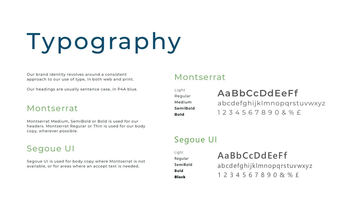
Typography: I chose strong sans-serif fonts which would be clean, bold, and easily readable - engineers often check the app outdoors or on the move, so legibility mattered.
Website Design
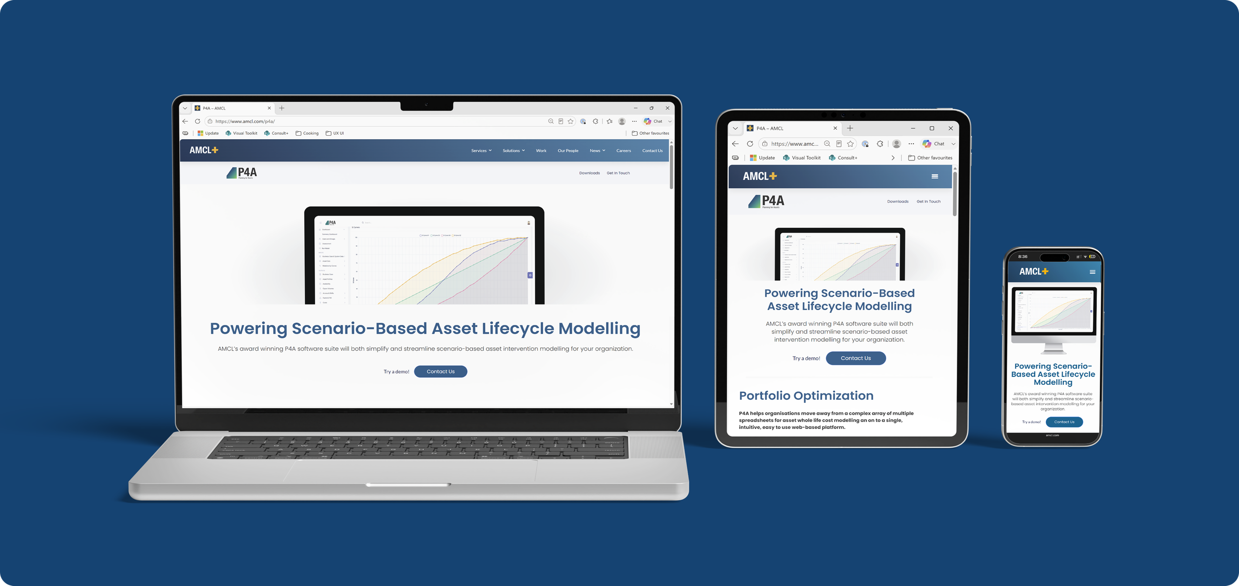
built a responsive website in Wordpress using Elementor, with different graphic images and length of copy content used from phone to full screen to maximize impact based on screen size.
Testing & Changes:
testing was done with several volunteer organizations in return for free one time use of the platform / tool.
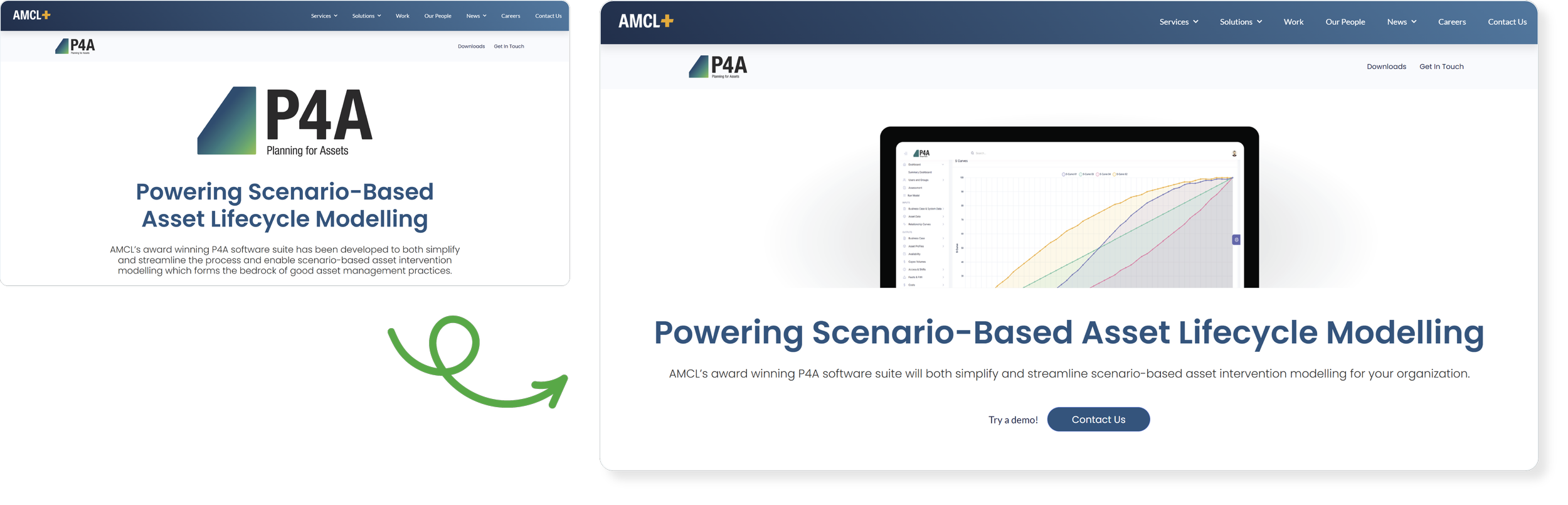
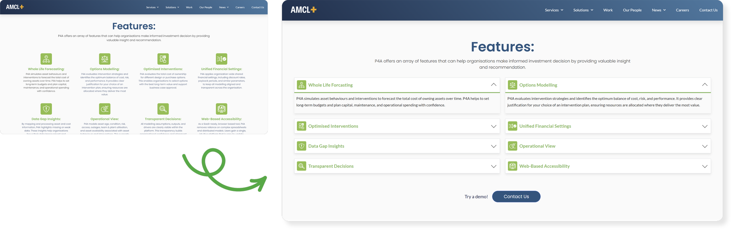
After speaking with the teams who viewed the website, we realized that viewers were getting fatigued by the amount of information presented on the front page. I reduced the overall text that viewers are confronted with to increase the amount of readers who get through all the materials.
reduced the text on the features section by adding nested boxes
I also added additonal touch points for ‘contact us’ after veiwing participants at differnet stages on the page all have to scroll to the top.
adding additional ‘get in touch’ buttons to increase traction
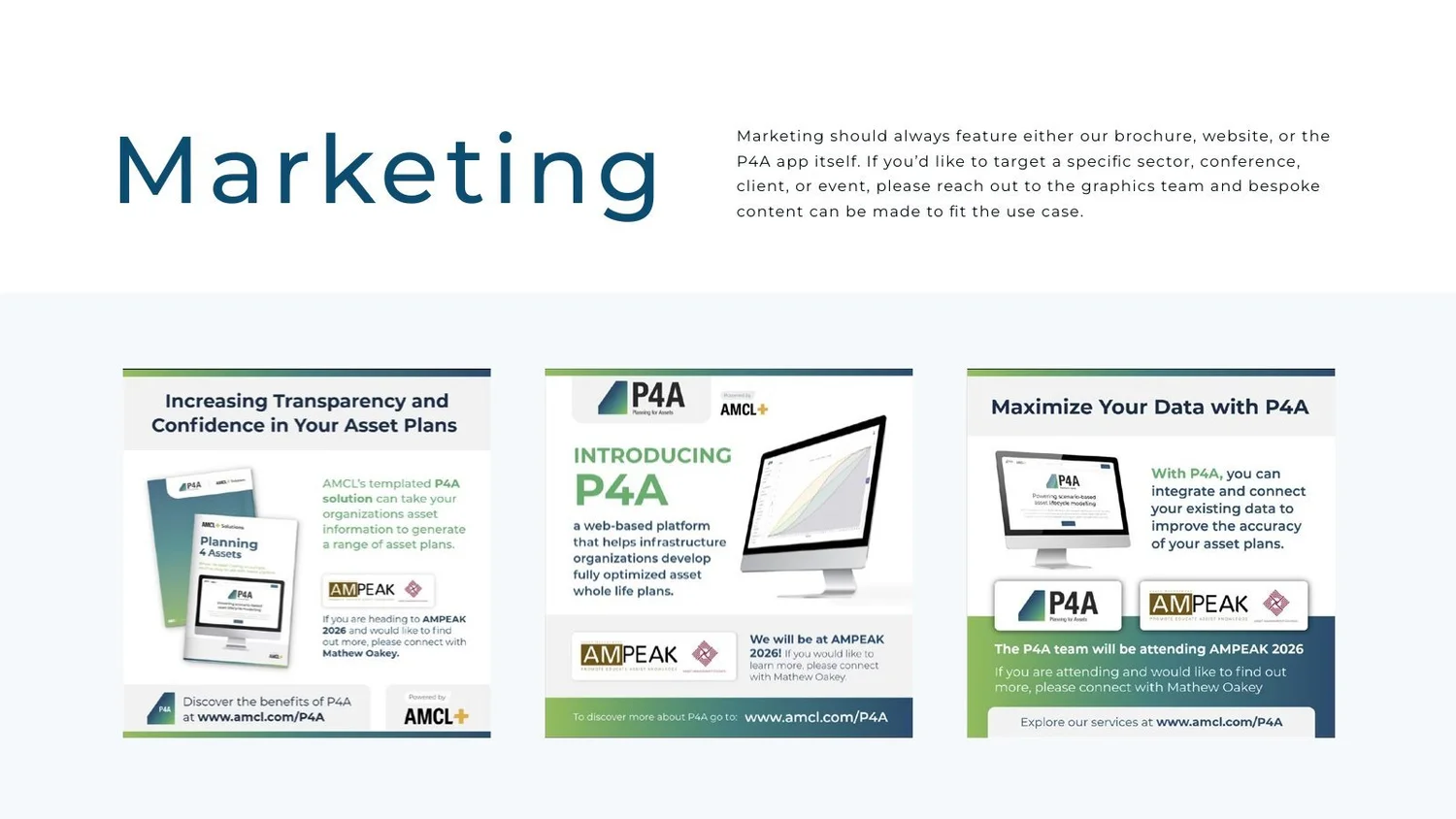
Marketing
sales deck
linkedin posts - animated
brochure - published