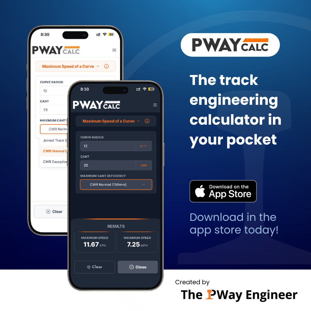
Designing the PWay Calc App
Solo designer on PWay Calc, taking a first-time founder's idea from spreadsheet to shipped iOS app, through branding, UX/UI, and marketing design.
Role Sole designer — brand, UX/UI, marketing
Team Founder, 1 Developer, 1 Designer (me)
Platform iOS
Year 2026
Overview and Challenge
PWay Calc is a railway engineering tool that consolidates the calculations engineers most often perform on site. Before PWay Calc, engineers did this math by hand, juggling a notebook and calculator and hoping they remembered every formula. The app replaces that with a single, reliable tool that runs the calculations for them.
As the project's solo designer, I worked with the app's founder, Alistair Grice, to take the product from zero to launch. It was his first product, so we had to develop brand and user trust from scratch. Alistair brought the vision, the technical background, and direct access to real users - his fellow engineers.
I structured the app's navigation so users could move through it without friction, and led the UX/UI design end-to-end, including wireframing, user testing, and final UI design. I also created the overall brand identity and the launch and marketing assets.

Branding
Color Palette
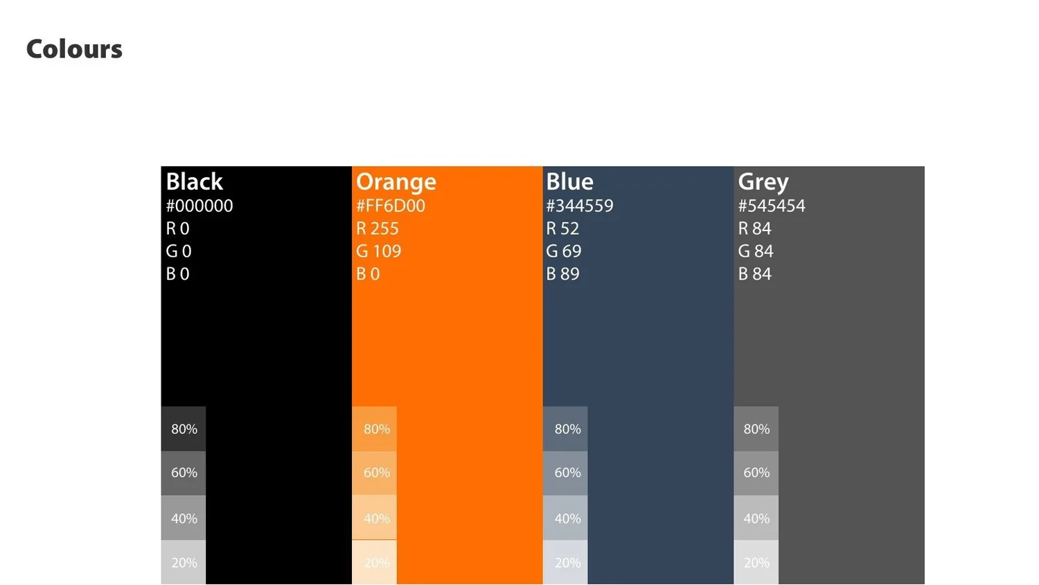
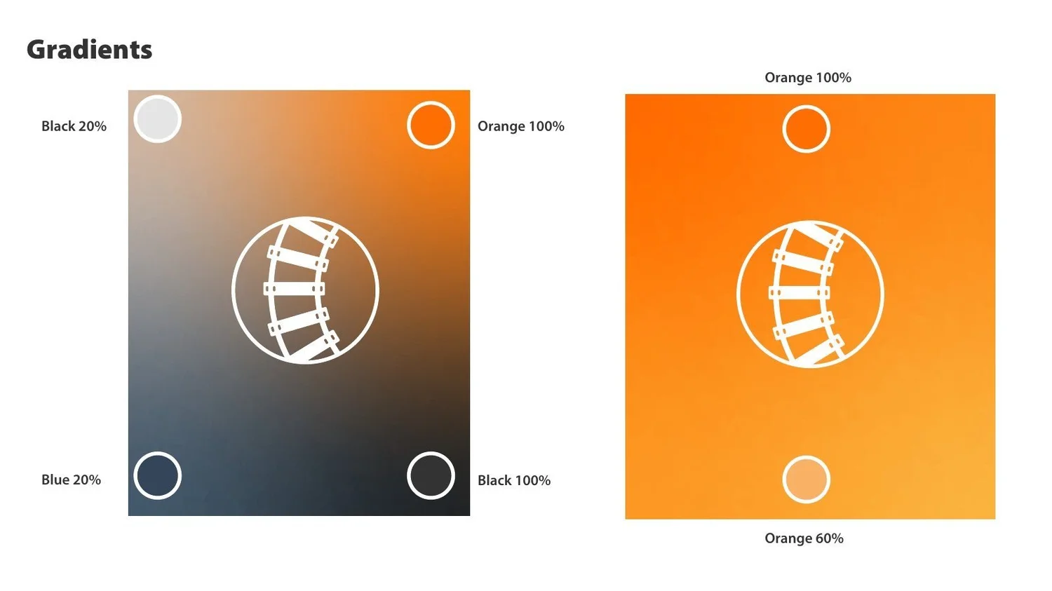
I chose a steel blue and orange palette to reflect the railway engineering context — steel blue nods to rail and industrial materials, while the orange (echoing high-visibility safety gear) adds contrast and energy.
Typography
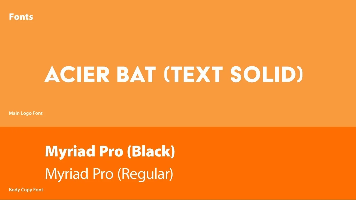
I chose strong sans-serif fonts which would be clean, bold, and easily readable - engineers often check the app outdoors or on the move, so legibility mattered.

Wireframe to Final UI
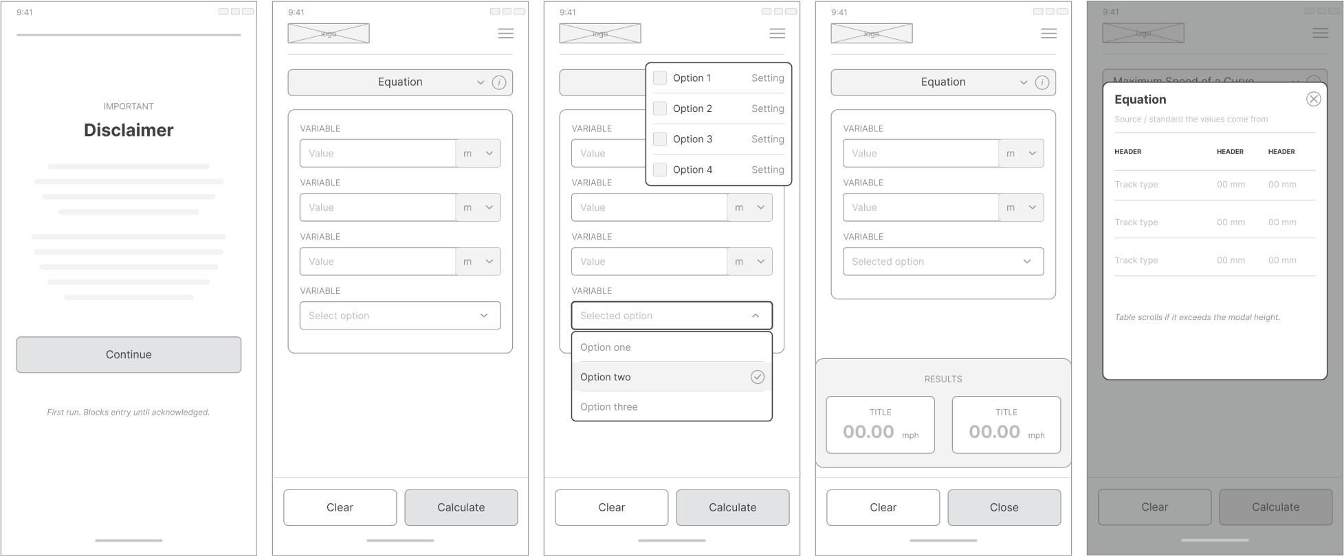
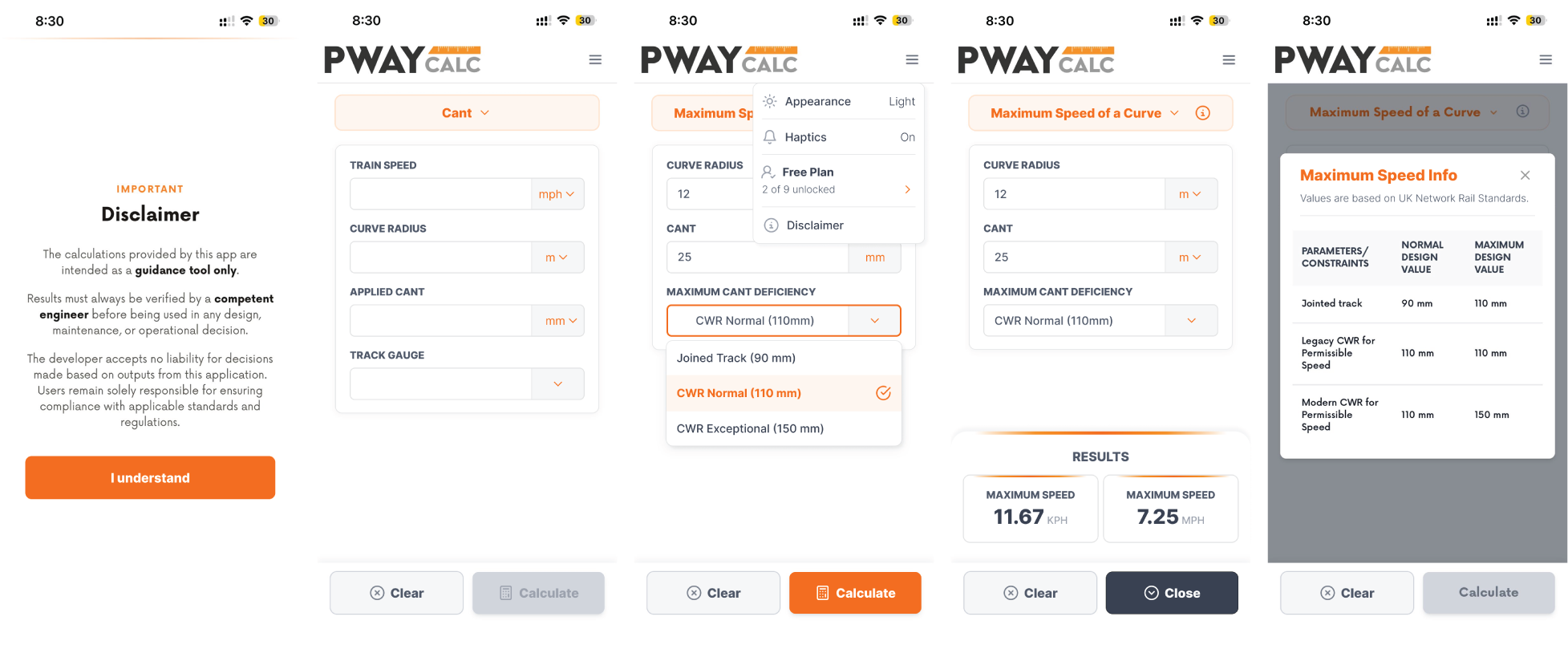
While the final plan was to have 3 tiers, each with additional calculators, we started by prioritising and building the free plan so that we could focus on testing.
Testing with 40 Participants
Next, we recruited around 40 testers, all engineers who preregistered to the app. In return for their participation they were given free access to the Pro version after launch.
We gathered feedback by emailing testers throughout the trial, and built an in-app reporting function that let them flag or screenshot an issue directly. I used that feedback to identify and prioritise improvements, including:
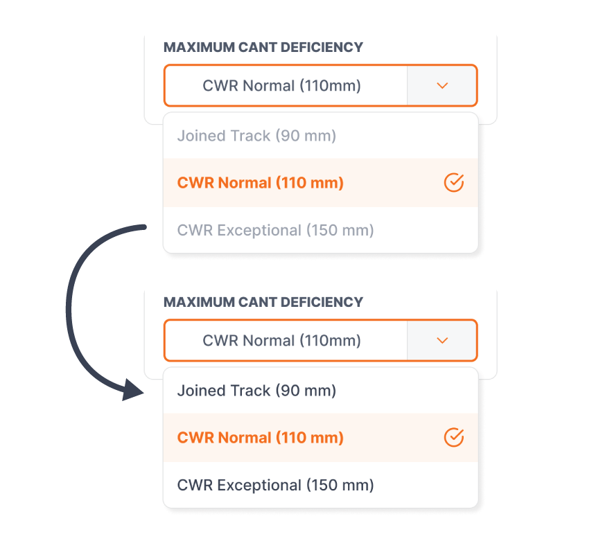
1. Engineers working on-site in different environments wanted increased readability.
I improved the text contrast in light mode and designed a dark mode for those working in dark environments such as tunnels or during night shifts.
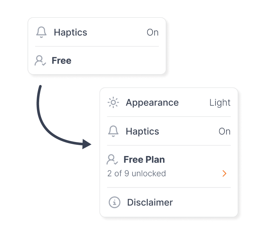
2. Users could not always recall the full benefits of the Pro plan.
I added the number of calculators unlocked under the plan info. Now when the settings are opened it is easier to quickly recall the full Pro benefits.
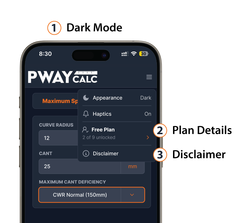
3. Users wanted to revisit the disclaimer to check information but it was inaccessible.
I made the disclaimer accessible from the settings, rather than only during setup to give users a way to revisit and review.
Marketing & Results
I produced the App Store listing, social assets, and launch campaign for PWay Calc, on LinkedIn and the Apple App store.
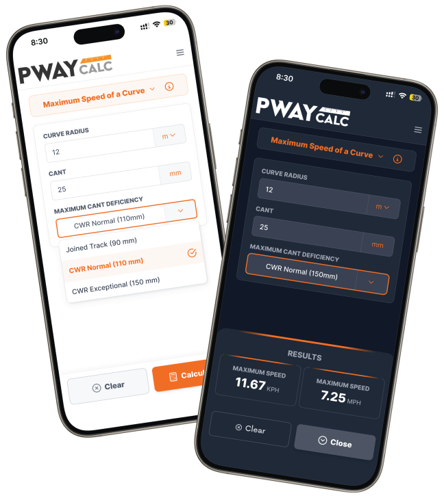
In its first month on the App Store, PWay Calc converted 89 downloads from 1.12K impressions, a 10.8% conversion rate, against a 3.8% average.